"Job #178, built for Hugh H. Ellison in 1927. A wonderful example of Buck's versatility, this Italian Renaissance design sits on the east side of Habersham, just north of Argonne." - Lewis Edmund "Buck" Crook, Jr.1898-1967 Atlanta Architect
But this is NOT what the kids want these days.
In the last six months I've been to estate sales at one Neel Reid, two Shutze's, and two Ivey and Crook's. So far they've torn down one Shutze and one Crook. The Elison is the least of the five houses.

It's photogenic and pink, but it's not so big: The main house is 3,172 square feet on 0.8035 acre. And it hasn't been updated in a while.

We tend to think that Buckhead houses are mansions but most aren't. This is a 3 bedroom 2.5 bath with some elegant public rooms. The rest is just a family house with tiny closets.
Have a look.
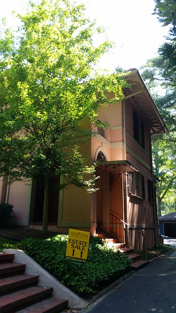
Neel Reid, Crook, and Shuzte designed adorable side entrances. Look for them.
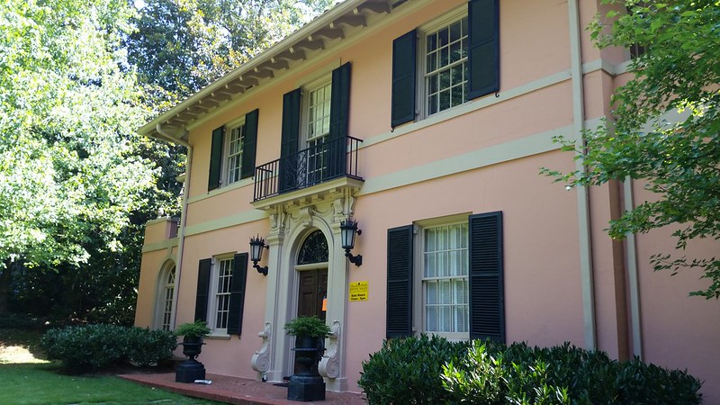
The front door is for special occasions. It's a little more beat up than the picture shows but I'll take this as is.
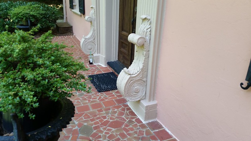
I don't know what you call these. The Architecture Tourist thinks big bodacious buttresses with volutes in acanthus wrap. Would the composition look right without them? (Thanks John Tackett, The Devoted Classicist and Merrium Webster these are "consoles" ... console: "an architectural member projecting from a wall to form a bracket or from a keystone for ornament."
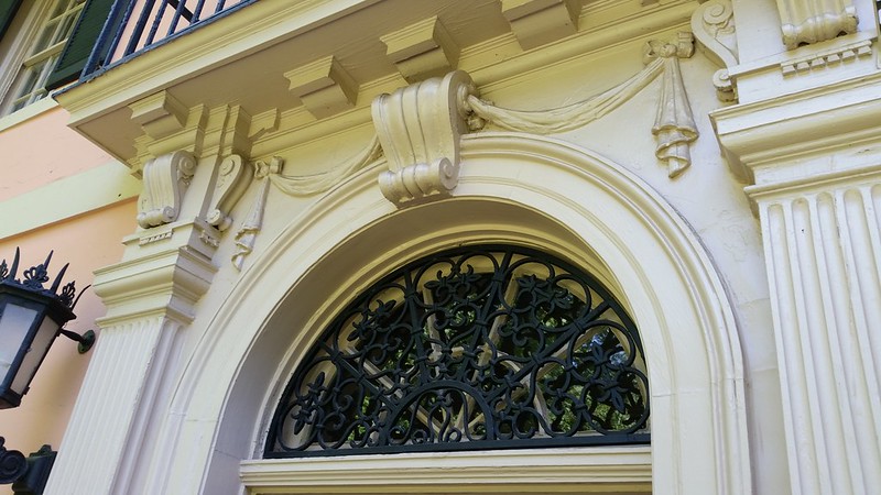
Wonder if the metal fan is original equipment. It pulls dark the door, shutters, and lanterns.A composition in pink with white and black accents.
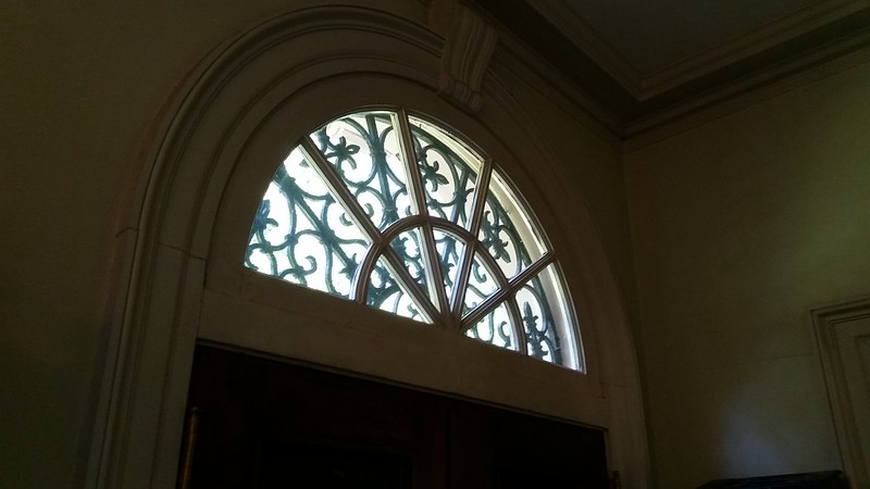
Inside I'd prefer more light and less metal.
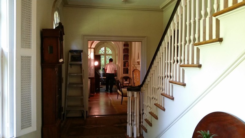
The entry has the stair, family entrance to the right and a zen view to the living room and sun room.
These are the fancy rooms, the rest have far less decorative detailing.
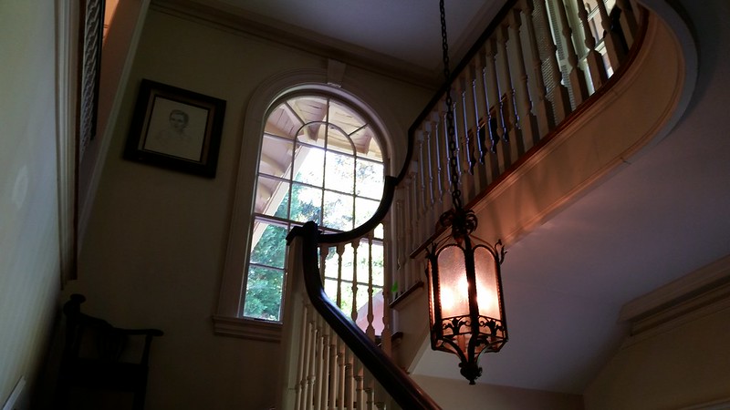
This is pretty much how the Georgia classicists did stairs and we should be glad.
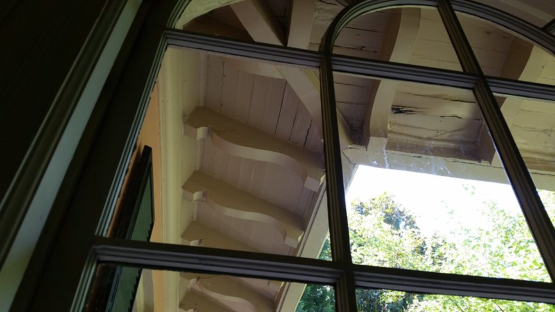
From the outside the windows look in proportion, they look just right. From inside you realize they are big. There are many views of the rafter tails under the eaves.
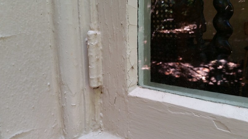
Some of the windows don't operate any more, these casement windows are in the sun room, probably haven't opened since air conditioning.
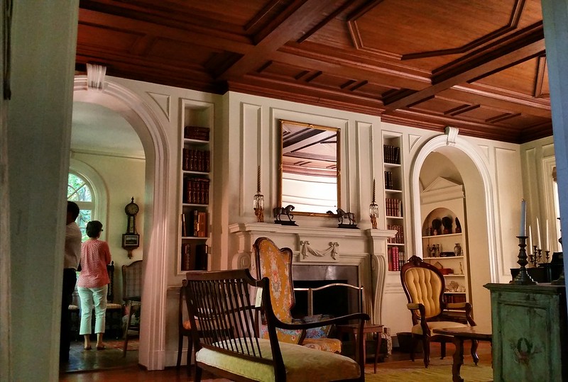
The living room took my breath away.
"Living room features magnificent heart pine ceiling modeled after a ceiling in Florence, graceful arches and handsome fireplace." Beachcam and Company from the real estate ad.
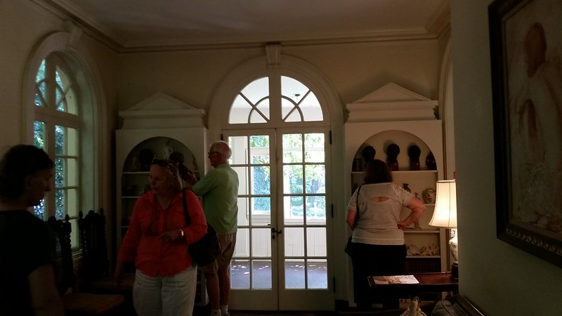
The sun room has big time detailing too. I didn't get such a good picture. The room out back is an add on family room.
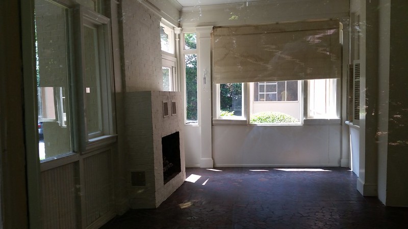
Here's the add on "family room" and I didn't want to look at it.
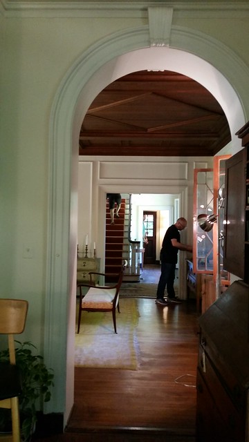
There is an enfilade across the whole front of the house linking the public spaces. This picture is from the sun room through the living room, foyer/stair hall, family foyer and family entrance. You can see from one end of the house to the other. A zen view. A great feature.
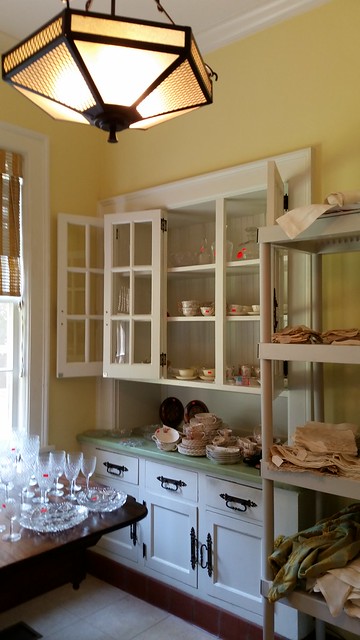
Pantry / breakfast room is cozy. See the how tall the window is?.
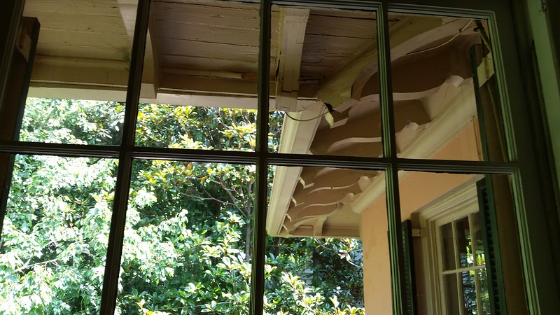
Upstairs has some nice pink and under-eave views. Looks it's age.
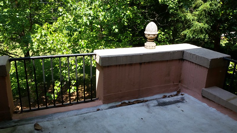
It feels substantial. Where does the water go?
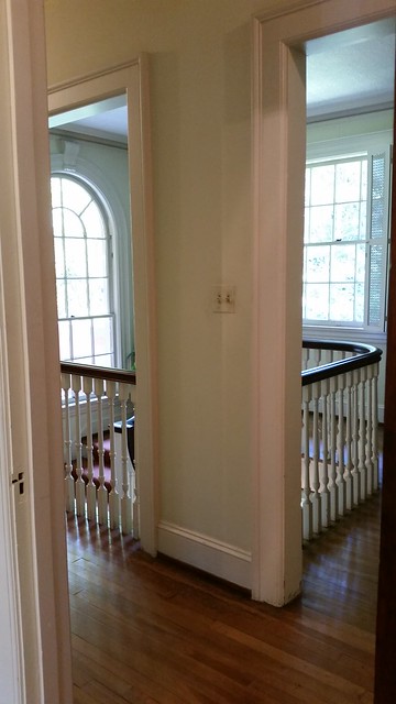
People lingered here. The corner stair makes a two-story shaft that brings light deep into the both floors and features a balcony with an inside-out view.
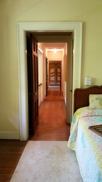
This is the bedroom hall. I'm looking from the little bedroom on the right side, across the stair balcony into the master suite on the left side of the house. Another little bedroom is off the hall to the right.
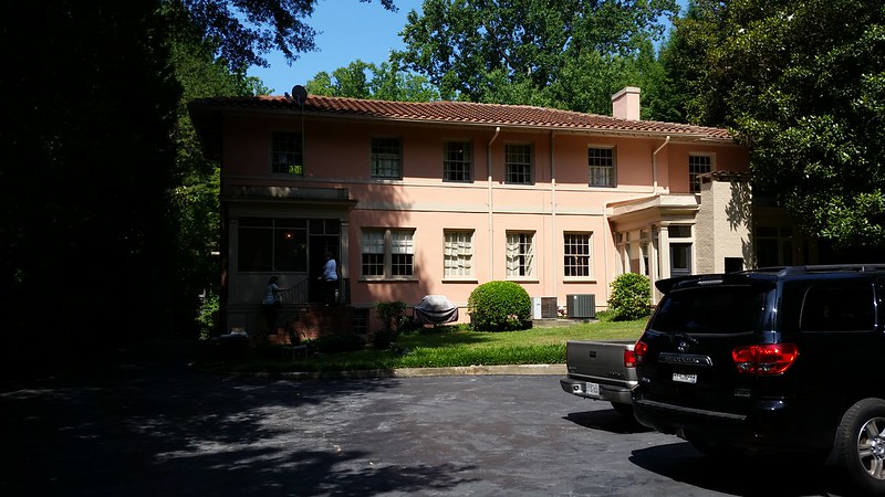
We can see the tile roof from here. Kitchen / service entrance to left. Family room bump-out to the right.
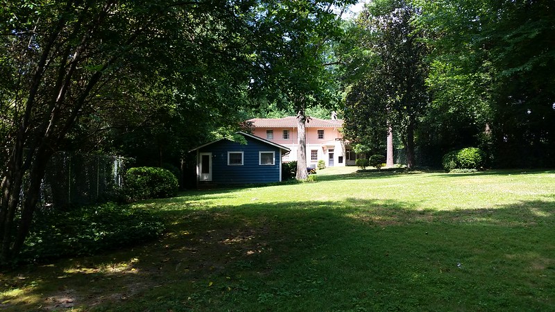
The lot is 400 feet deep, room for another house if they want to restore the original house. But what if you want a pool?
I think it's a goner. 10,000 square feet seems the minimum up here.


0 komentar
Post a Comment